Pinterest

Sunday, June 28, 2009

Patriotic Birdies!

Is it just me or do we all feel a bit more patriotic as we get closer to July 4th? And I think that red white and blue together are lovely colors. 

I believe its a good idea when you can, to be deliberate in your stamping, by that I mean having a reason for everything you put in your card or creation. I chose the scalloped circle nestabilities and put the white ringed with red in that order because it reminds me of the bunting you see draped on country farmhouses on the porch railings. I chose the Martha Stewart flower punch because bright colorful flowers are part of summer, but they also slightly mimic fireworks, so I added the bright red microbeads to the blue and white flowers for centers. The red gingham reminds of of summer picnic cloths, the white vintage die cut in the corner, the gingerbread you find on older homes. The light blue panel that backs everything up on the kraft represents the blue sky you want to appear when you have a picnic. 

Even knowing I wanted to use this set in a patriotic card, I was still a bit puzzled for layout, but Clear Dollar Stamps is having a guest designer contest right now and they posted a layout that looked like fun to try, this is very loosely based on that layout. You can see the details for the contest and layout here. I liked the divide in the middle, so I could have my red checked background AND include blue! The corner of my card bent a little, it was a windy day and while I thought I'd utilize natural light to take my photo, it blew over! Thanks for looking.

Stamps: Clear Dollar Stamps Pretty Perches, Stampin' Up! Dad's Day (BG on blue panel)
Cardstock: SU Kraft, Bashful Blue, Pacific Point, PTI Poppy, Neenah Solar white, red gingham check DP from Hobby Lobby
Ink: SU Green Galore, Glorious Green, Close to Cocoa, white craft, Pacific Point, PTI Poppy, Versamark dazzle pad
Other: Martha Stewart punch, red microbeads, white lacy sticker, Cuttlebug vintage die cut, Azure blue glitter, blue rivet, white button . . . I think that's all

Blog Award

One of my fellow Ocean's 11 bloggers from splitcoast stampers awarded me this cute little blog award, thank you Dell!  You can see her blog at www.dadoodlediva.blogspot.com. She chose seven ladies who according to this award show an attitude of gratitude. 
  I didn't post this right away because you are in turn supposed to give these blog awards away and I still have one from Women to Women Sharing Jesus to give away too, but this is one of those blog etiquette things where I often stumble. 
  I know I'm grateful for the friends I've made online, you all help me keep my sanity! I know I'm grateful I have the time, opportunity, resources and a wee bit of giftedness to be able to craft and create. 
I believe I would like to pass this along to:

The Mama Monkey at The Monkey Hut
Diane at Mom of Five
Joanne (Jojot) at Inky Ocean Gazer

Hope I did that right. Thank you again Dell! 

Thursday, June 25, 2009

Papertrey Ink June Blog Hop


If you say 'summer' to any one of my kids, they will instantly thinkof Empire, Michigan. Our most special family vacations have been spent there near Sleeping Bear Dunes National Lakeshore
The beaches are gorgeous, the sand dunes spectacular and the memories irreplaceable. I choke up every time I look at my inspiration photo, we always have good times there.  

For the PTI June blog hop we were to choose a picture or representation of summer and recreate that in card form. This is the sunset over Lake Michigan. You see two people kayaking in silhouette and my son walking along the edge of the water. There are no words to describe the colors in a Lake Michigan sunset, the photo shows you best. 
Add Image
I tried to recreate the mood with a variation on the wrinkle free distress technique. Using a piece of wax paper, I swiped a strip of color from Ranger Distress inks using first Broken China, then a thin strip of Dusty Concord, then a bit of Dried Marigold and Spiced Marmalade. Then you spritz it with water until the ink beads up. I laid down a piece of white cardstock to capture the colors and then dried them with a heat gun. For a more traditional technique I would have swiped the cardstock again, for a more mottled look, as I did in the CDS card in a post below, but I wanted bands of color to represent the sunset. 

The water really shimmers in the photo, so to recreate some of the shimmer I mixed my own blend of soft sky reinker drops with Perfect Pearls in water and a spray/mister bottle, masked out the top part of the image and sprayed the water portion with homemade glimmer mist. In the closeup photo you can see the shine. I used waterfall stickles for some of the wave action. Then I stamped the Life images in black craft, embossed them and did the sentiment. That was tricky I have to admit.
 
First I inked half of the sentiment in black and stamped it, wiped it off carefully and stamped on scrap paper to make sure the ink was off, inked the second portion of black, lined it up using the grid block, stamped again, then inked the last word 'moments' with a Kaleidacolor Desert Heat pad for the fiery yellow and orange and stamped the last word. This is one of those cases where I was soooo tempted to add ribbon or twine or a button or something and decided to leave well enough alone. Thanks for looking. 

Stamps: Papetrey Ink Life
Cardstock: PTI white, SU black
Inks: Ranger distress ink pads in Broken China, Dusty Concord, Dried Marigold, Spiced Marmalade, SU black craft, Kaleidacolor Desert Heat
Other: SU Soft Sky and Bordering Blue reinkers, Perfect pearls powder, mister spray bottle (to make homemade glimmer mist), waterfall stickles, clear EP

Wednesday, June 24, 2009

Shadowbox Birdhouse

I know I've used this DP until you're tired of seeing it, but it is so happy and springy. I thought it went so well with the birdhouse images from my new Clear Dollar Stamp set. 
  Shadowbox is one of my favorite layouts and I thought it could help make a nice outdoor scene for this birdhouse. I made a sky background first, using Cindy Motherway's tutorial, sweet Cindy, thank you for sharing it! Then I stamped the branches and leaves over it. I inked the leaves in green galore first then rolled the edges in glorious green. 
  I stamped the birdhouse in turquoise and coral craft, I just liked those two colors together. Then I embossed it to give the birdhouse a bit of shine. The chain is inked with silver craft and also embossed. The birdhouse and the red bird each are popped up on a dimensional to give the card even more depth. This style card folds flat for mailing, so even though the sentiment hangs over the edge of the middle panel when open, folded flat it fits quite nicely. Thanks for looking. 
Stamps: Clear Dollar Stamps Pretty Perches and Christian Sympathy
Inks: Bashful blue, Cameo Coral craft, Turquoise craft, black, Real Red, Green Galore, Glorious Green, Close to Cocoa
Paper: Bashful blue, Neenah solar white, DP 
Other: Waterfall stickles, nestabilities ovals and . . . that other shape, prima flowers

Saturday, June 20, 2009

Butterflies on the wing


For the second challenge, we were to make a spiral cut card. First time for me and what fun! I am definitely going to make one of these again. The instructions for it are here

The first photo on the left shows the inside, my little spiraling butterflies. Easy peasy Lemon Squeezy (as the one commercial says) when you use a punch. I took my Martha Stewart butterfly punch, opened the drawer where I (hoard) keep my DP and punched five times in different colored scraps of paper. Voila! A flock of butterflies to put inside my card. (do butterflies travel in flocks, packs, or something else?) I have no idea whose DP is whose, the minutes I cut a piece of the name off, and have scraps left, I'm lost. Anyway, thanks for looking and try this technique, it is a lot of fun!
Stamps: Stampin Up Winged Things, PTI Green Thumb sentiment additions
Ink: Black stazon
Paper: SU Tangerine something, PTI lemon, neenah solar white, assorted DP
Other: MArtha Stewart butterfly punch, labels 4 nestability, orange GG ribbon, blah, blah, blah

Life in Potato Colors

We had a power outage for about a day because of strong storms. Luckily we have no damage and I think most of the food in the refrigerator survived, thanks to my DH who ran out and bought ice and put it in big bowls inside freezer and refrigerator. 
Before we lost power I started playing in the SCS VSN appetizer night. Five different challenges, so far I've gotten to two of them (there wasn't a stamping by candlelight challenge or I'd have been all over that one!)
 For the first challenge, posted by Darth Tater (I'll wait a minute for you all to catch up to the joke), we had to create a card using colors of a baked potato with toppings, including brown, green for chives, white for the potato interior, yellow for buttah! And the extra color, that had to be added in a different fashion, through ribbon or glitter, was red (like paprika!) 
I went lightly on the brown, only using it in the sentiment (I never eat the potato skin anyway), and the Life set works great in avocado and overlaid with a white embossed layer. A touch of red stickles to my green stems and voila! My potato card was done. Thanks for looking. 

Friday, June 19, 2009

Wrinkle Free Distress

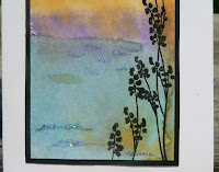
I always like trying new techniques. Sherry Cheever posted a tutorial on splitcoast a few weeks ago for wrinkle free distress backgrounds. Don't be fooled, this took me at least five tries to get something halfway decent. :)
  The minute I saw the Clear Dollar Stamp set I was attracted to the silhouette images and thought they would make a nice match with this technique. 
  For the primary panel with the stamped image I used Broken China, Mustard Seed, Peeled Paint. I used aluminum foil first, but then wax paper seemed to work better instead. I think I'll invest in the Ranger non stick craft sheet soon. Watching Sherry's tutorial is the best way to learn, but basically you swipe the pads across a non stick surface, spritz them with water until the ink beads up, then press your paper down on the ink, dry it with a heat gun or craft iron, then blot the paper again until you like your results. For the back panel I used Broken China, Antique Linen and Peeled Paint. Thanks for looking. 
Stamps: Clear Dollar Stamps Pretty Perches, For Our Lord
Paper: PTI Spring Moss, SU Old Olive, black, Neenah solar white
Ink: Ranger distress inks Broken China, Mustard Seed, Peeled Paint, Antique Linen, SU black craft ink
Other: wax paper, spritzer, Martha Stewart edge punch, ribbon from Mike's